Colour psychology explores the mental and emotional effects it has on human behaviour. This was examined by Swiss psychiatrist, Carl Jung in the early 12th century, when he investigated the influence of specific colours on the mind which led to the practice of colour therapy. Cognitive development and creativity are greatly informed by colour, particularly when it’s applied in a learning environment. The considered use of colour can support our intellectual strengths, influence performance during a learning experience, response to the task, productivity, and consequently our overall well-being in that space.
Blog

New Nordic School by the Sea. Photographer Kikka Kantinkoski. Image sourced from Pinterest.

Curtin University, drapery design, Upland by Zepel. Design: Hillson Beasley & Design Theory. Photographer: Dion Robeson.
Puffalo Couch, Puffalo Universal Group, Ross Didier. Image sourced from Pinterest.

University of Adelaide, wallpaper by Casamance. Architect: Arm Architecture. Photographer: Lyndon Stacey.
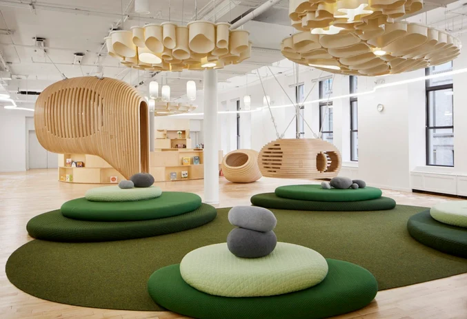
WeGrow School. Photographer Dave Burk. Image sourced from Pinterest.
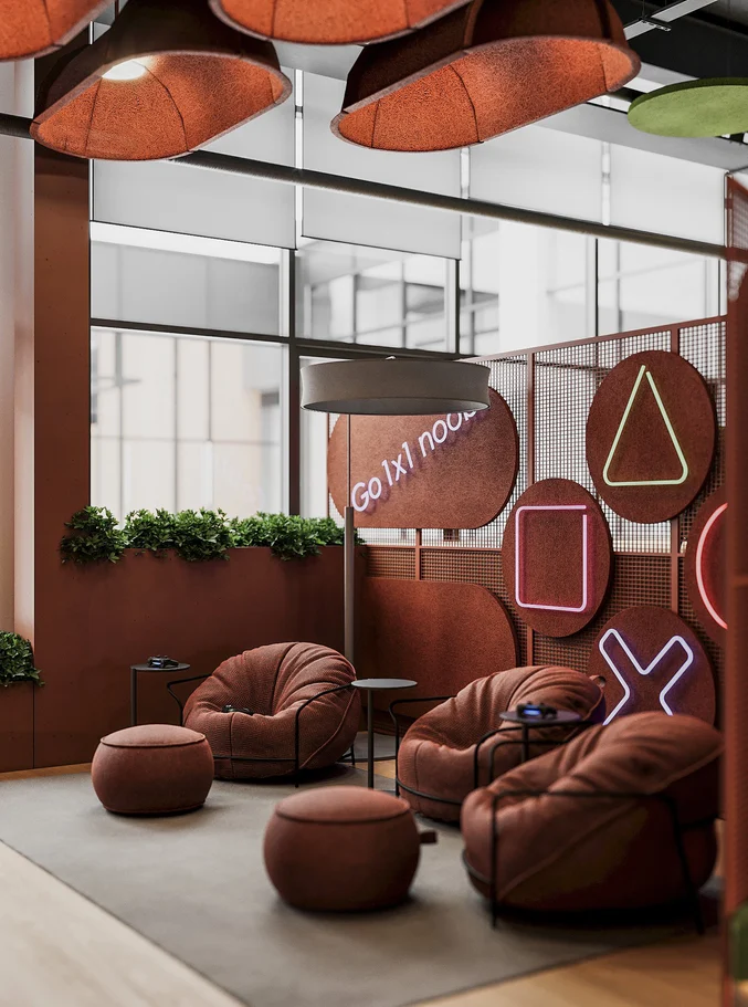
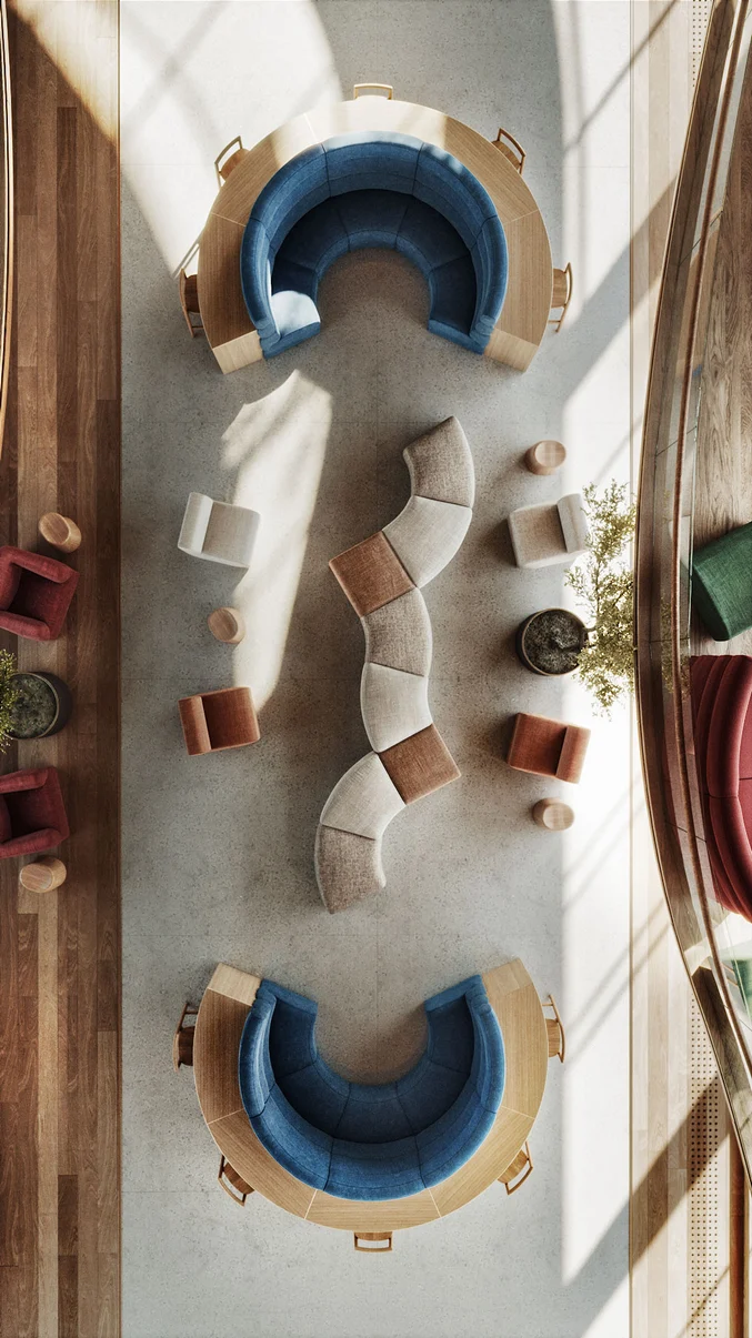
Image sourced from Pinterest.

Image sourced from Pinterest.
Bright Minds: The Role of Colour in Learning Spaces
When making design and colour choices in educational spaces, it’s important to consider the following:
- What mood and feeling does this learning space require, or which colours align with the activity primarily undertaken in this space?
- Consider the general age of the students in this space. What is an appropriate colour choice in this space?
- How can colour be applied to the furnishings and materials brought into the space?
It’s then important to explore which colours enhance concentration, focus, and creativity. Exploring colours with a universal appeal that are drawn from nature is a great place to start, as the attraction to these shades is a shared experience for all. This notion supports the Ecological Valence concept which references the positive affects we experience from certain natural colours in our everyday, such as blues and cyan that remind us of the ocean and sky, and various hues of green that remind us of healthy vegetation. It’s no wonder these shades are the most popular in education environments.
Let’s explore how colour supports typical learning behaviours and enhances educational spaces:
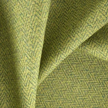
Green for Concentration:
Green is considered the most popular colour in educational spaces as it’s the most visually soothing and encourages prolonged concentration and reading ability. This shade promotes relaxation and peace so is a great tool to support mental clarity, logical thinking, and strategising.
A Biophilic Design approach is valuable to consider when using green to explore the following elements in interiors: environmental features such as plants, incorporating patterns and shapes derived from nature, light and space, and designing with a cultural, spiritual connection to the environment in mind. Many of these principles can be achieved through direct human connection to nature, or indirect connections such as raw materials. Combining hues of green with warm tones is a great method to diffuse a surplus of serenity in a space, create a pause from the predominate shade, provides opportunities to add natural texture, and promote balanced activity.
Use shades of green in the following classrooms and educational spaces: Libraries, Psychology & Social Studies.
Blue for Creativity:
Blue boosts creativity and cognitive performance which reflects its calming associations with purity, water, and the sky. These associations bring a great sense of peace to a space that encourages mental clarity for exploration and innovation. This in turn increases productivity and is best used in classrooms where challenging subjects are taught, or in spaces where students experience elevated stress.
Use shades of blues in the following classrooms and educational spaces: Art & Music, Mathematics & Scientific Subjects, & Exam Halls.


Red for Motivation:
Colours from the red palette evoke feelings of power, strength, and confidence which increases heart rate and encourages conversation. It’s important to note however that incorporating strong colours in moderation for younger students is vital, as it can create over stimulation and excitement. Pops of shades from the red family can be included in accented ways to avoid this, such as in flooring, artworks, and furnishings to enhance mood subtly. Red hues are also found to enhance attention to detail, so adding these accents in student’s periphery, therefore at eye level, can boast concentration, creativity, and consequently work performance.
Use shades of red in the following classrooms and educational spaces: Performing Arts & Physical Education.
Orange for Innovation:
Warm shades from the orange/ochre palette increase innovation, communication, enthusiasm, decision making and problem-solving abilities. They also foster endurance in learning spaces, are mood enhancing, and improve neural functioning by increasing oxygen to the brain. Effective discourse and collaboration within group environments is proven to be enhanced when surrounded by warm colours.
Use shades of orange in the following classrooms and educational spaces: English, Foreign Languages, History, & Common Areas.
Yellow for Positivity:
Shades of yellow are reminders of the sun rising and bring a sense of lightness and brightness to a space. Adding this shade in a balanced approach within a colour scheme creates positivity and warmth between students. Incorporating too much of this shade, however, can create eye fatigue so is best used for styling accents.
Use shades of yellow in the following classrooms and educational spaces: Study Centres, Common & Break Areas.


Purple for Reflection:
Hues in purple support spiritual awareness, creativity, wisdom, and self-knowledge. They can evoke feelings of loneliness and depression in some when used excessively, however, subdued forms such as lavender can create peace, space for contemplation and tranquility.
Use shades of purple in the following classrooms and educational spaces: Independent Study Rooms, Health & Human Development.
Complementing Neutrals
Incorporating neutral tones in a colour scheme is a great method to create visual pauses against bolder shades and prominent features in a space.
White: creates feelings of possibility, hope, and openness. Adding a large quantity of these shades in their brightest iterations can create a sterile space that lacks warmth or welcoming energy.
Grey: layering various shades and textures of grey can create a calming and sophisticated scheme. Add shades of grey against stronger colours to avoid a lack of energy in the space.


Creating Colour – elevating learning through upholstery and curtains
Upholstery, drapery, and furnishings are fundamental in supporting the colour scheme in a space. These elements add texture, form, movement, patterning and even printed imagery in a wide variety of textiles and materials. Our FibreGuard Pro range is an ideal choice for education spaces as they boast superior high-performance technology, include a moisture barrier to protect students from harboring germs and bacteria, are easy clean, FR tested, Oeko-Tex certified and exceptionally durable. The anti-microbial properties embedded in the yarn define this range and create peace of mind for teachers and students working in high-traffic spaces. They are most importantly presented in a variety of contemporary designs, patterns, and on trend colours to complement a wide variety of educational interiors. Explore our FibreGuard Pro range here.
Drapery designs from our FR-One range are the optimum choice for high traffic interiors and learning environments. These designs boast superior fire-retardant attributes that defuse the development and spread of flames with their self-extinguishing properties. These sophisticated drapery designs are developed and tested in independent, certified laboratories on a regular basis to ensure their quality is upheld, and natural look and handle retained. This range is also available in an extensive range of designs and colours that can be transformed into countless interiors schemes. Explore our FR-One range here.
Selecting colours within education spaces is the most economical and impactful approach to create uplifting, energising, and stimulating learning environments. There is great evidence to support links between the full spectrum of colours and types of engagement that can be used as learning tools. There is so many possibilities when tailoring learning experience through colour, texture, and pattern where activities and responses such as calm, focus, socialisation and collaboration can be targeted.


Baz Luhrmann’s biographical masterpiece, Elvis, explores the life and music of American rock 'n' roll icon Elvis Presley. The visual spectacle includes all the glamour and eccentricity that we have come to admire from Luhrmann’s films, all adorned with rhinestones, glitter, and stylised interiors...
